Color Theory, Psychology & Free Palettes
Your palette is one of the most important aspects of you brand identity, often more memorable than a logo.
Colors contain so much energy, historical context and subtle meaning. Selecting your color palette is a mix of color theory — the science and rules — and color psychology — the meaning and emotive qualities contained in each color.
My advice is to learn the rules first so you know how to break them.
Be playful with your color names!
“It is the best possible sign of a color when nobody who sees it knows what to call it.”
– John Ruskin, 1859
Color Theory Basics
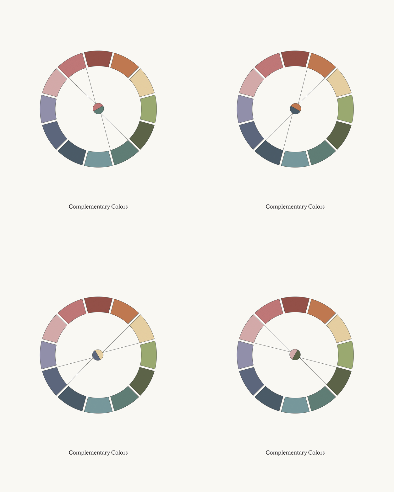
Complementary Colors
These are two colors that are across the color wheel. They will provide contrast and harmony to your color palette.
They’ll also balance the color temperature of cool and warm colors.
They don’t have to be evenly used, however, you could have dark purple as your primary brand color with subtle splashes of yellow or gold as an accent color.
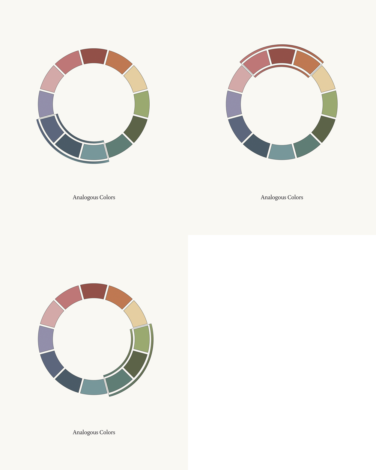
Analogous Colors
This refers to the three colors that are side-by-side on the color wheel.
This is great if you want your palette to lean into a dominate side of the color wheel while still giving you a variety of hues to work with.
For example: If I had a strong water symbolism for my business, it could be beneficial to incorporate several hues of blue. I would still recommend having at least one complementary color to create harmony in the palette, such as a touch of orange to bring warmth into the brand.
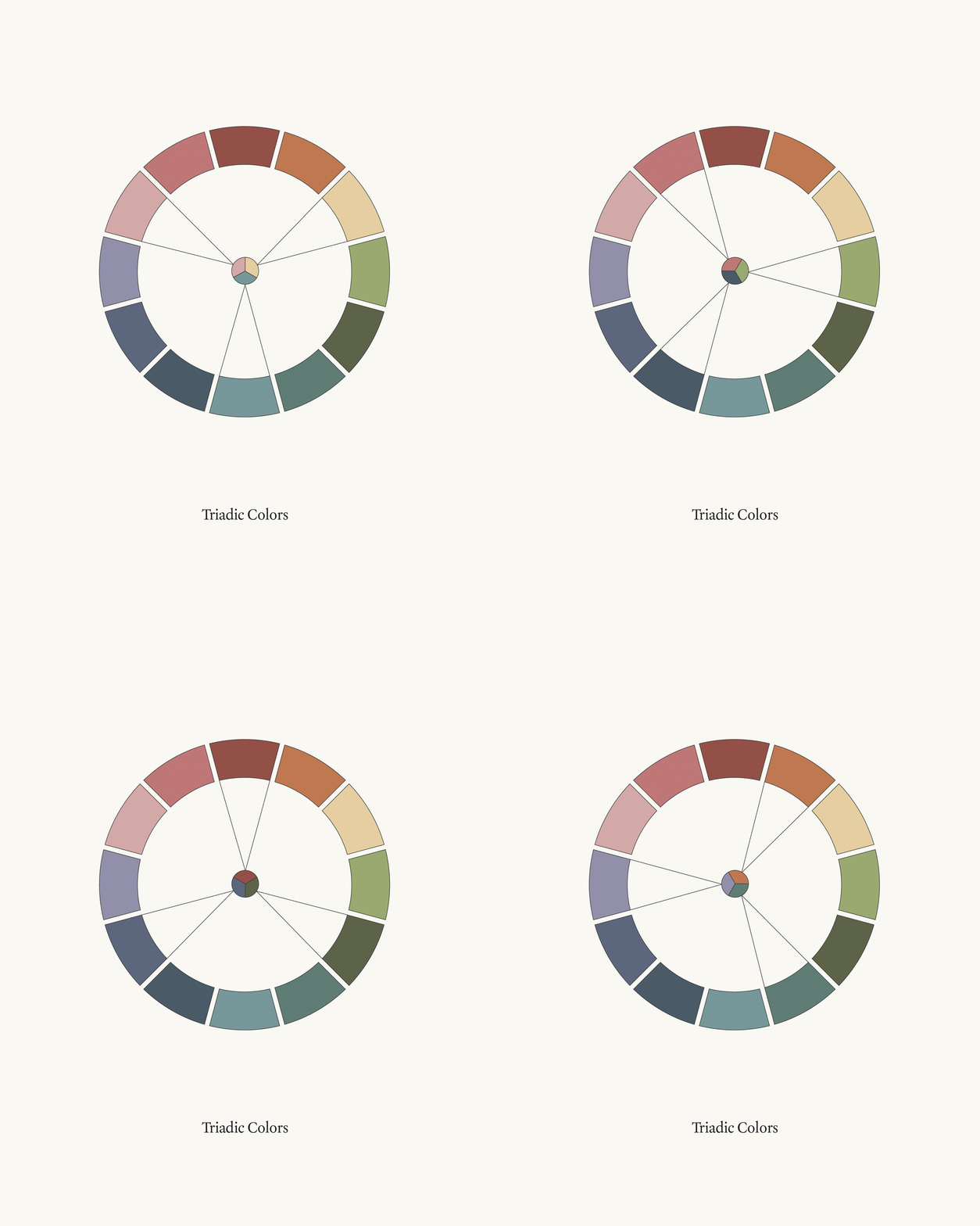
Triadic Colors
This refers to three colors which are across the wheel in a triangle pattern. They will provide high contrast, boldness and harmony to your color palette.
They’ll also balance the color temperature of cool and warm colors.
If you want a well balance color palette that isn’t as vibrant, you can play with the shade, tone and tint.
For example: If you wanted to use blue, yellow and pink to represent your brand but the palette was feeling too vibrant — you could explore tinting or toning down the pink to a light, white-pinkish color. Then deepening the shade of the yellow to a mustard or golden color.
Monochromatic Colors
Mini Latin lesson:
Mono = Uni / One
Chromatic = Colored
This is a system of colors that use the same hue but adjust the shade, tone or tint to create a subtle color shift.
This is a great way to expand your color palette without introducing completely new hues.
You’ll want to be cautious with how you implement these monochromatic colors. These are beautiful to use as background colors and in illustrations to create depth. However, using these subtle colors in both background and text will create a low contrast look which may be unaccessible to read.
Hue, Tint, Shade & Tone
Hue: A specific color
Tint: Adding white to the hue for a brighter color
Shade: Adding black to the hue for a darker color
Tone: Adding grey to the hue to for a less saturated or vibrant color
Grey avoids the binaries of black and white — it blends them together and tones down in a more subtle, “centered” way. This is often referred to as “toning down a color”.
Personally, this is how I explore color. You could say that all the color wheels above are “toned down”, literally meaning, I added grey to each color to they wouldn’t be so “hot”.
Color Psychology
BLUE
Tranquility, Peace, Security, Trust, Intelligence, Stability, Loyalty
TEAL
Revitalizing, Infinity, Truth, Faith, Dignity, Elegance, Serenity, Strength
GREEN
Environment, Healing, Earth, Fertile, Fresh, Wealth, Growth, Harmony
YELLOW
Joy, Optimistic, Creativity, Cheer, Hope, Energy, Happiness, Enlightenment
GOLD
Wisdom, Richness, Value, Tradition, Prosperity, Spirituality, Generosity
ORANGE
Courage, Confidence, Friendly, Free, Bold, Warmth, Enthusiasm, Stimulating
RUST
Romance, Longing, Physical, Blood, Fireside, Redwoods, Sensation
RED
Passion, Sensuality, Power, Heat, Strength, Desire, Fire, Love, Excitement
CORAL
Spirituality, Acceptance, Positivity, Welcome, Kind, Social, Warmth
PINK
Youthfulness, Love, Tenderness, Calm, Playful, Inner Peace, Affection
LILAC
Innocence, Spirit, Tranquil, Soft, Delicate, Caring, Happiness, Simplicity
PURPLE
Tranquil, Harmony, Royal, Wealthy, Passionate, Creative, Innovative
DEEP BLUE
Openness, Depth, Devotion, Meditative, Tranquility, Wisdom, Introspection
CHARCOAL
Practical, Versatile, Security, Solid, Secure, Reliable, Graceful
BLACK
Authority, Mystery, Darkness, Depth, Shadow, Drama, Elegance, Classy
BROWN
Grounded, Growth, Thrifty, Balance, Nature, Comfort, Nurturing, Longevity
TAN
Dependable, Flexible, Crisp, Neutral, Natural, Organic, Health
WHITE
Clarity, Purity, Minimal, Clean, Easy Freshness, Neutrality, Space
FREE RESOURCE FOR YOU
Access Color Palettes For Your Brand
Now that you know the color theory basics and psychology you can use these palettes to get started or be inspired to create your own!
SAVE ON PINTEREST FOR LATER


